ShopDreamUp AI ArtDreamUp
Deviation Actions


Suggested Deviants


Suggested Collections


You Might Like…


Featured in Groups


Badge Awards
Description
© Ben Heine || Facebook || Twitter || www.benheine.com
____________________________________________________
NEW: Print now available!
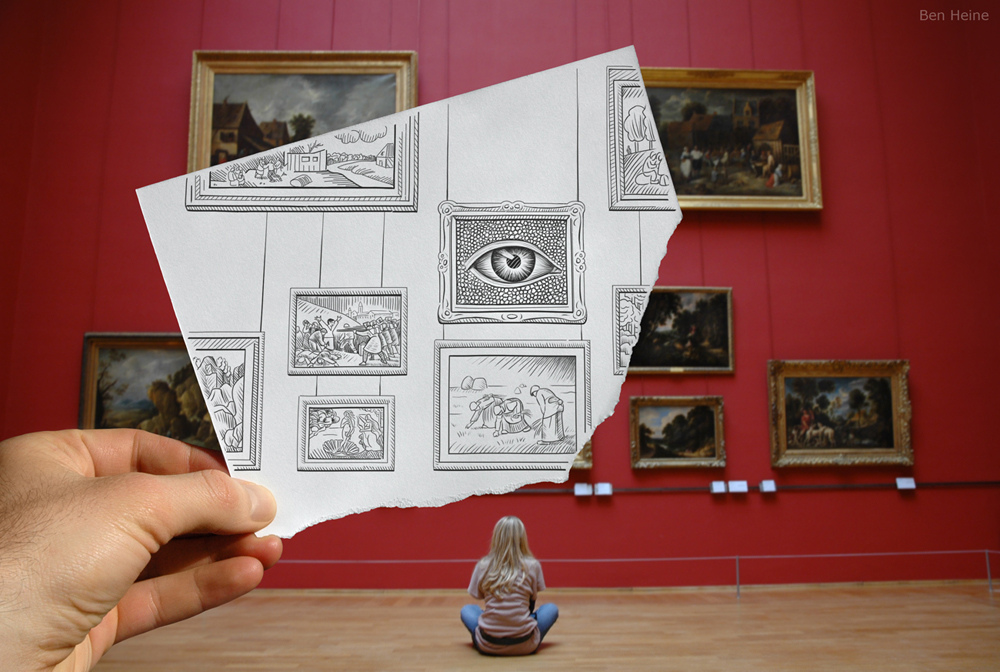
I took this photo in the "Palais des Beaux Arts" of Lille, France (I also made the drawing)
I've represented on the paper 3 of my most favorite paintings:
- "The Third of May 1808" by Francisco Goya (the painting is much bigger in the real life)
- "The Birth of Venus" by Sandro Botticelli (the painting is much bigger in the real life)
- "The Gleaners" by Jean-François Millet
The big Eye in the centre of the composition is something I added because what would visual art be without the tool to see it?
In my opinion, the human eye and brain and the way we interpret art are even more important than the artworks themselves. The model is my sweet Marta.
Update: See THIS VIDEO showing some 18 Pencil Vs Camera images in progress (with a small animation and an original musical compo).
See the whole "Pencil Vs Camera" album
____________________________________________________
For more information about my artwork: info@benheine.com
____________________________________________________
Random features:


The Eye
A poem by Peter S. Quinn
Here I am or if I am
The eye of seeing all
Some of it is a scam
As it's not on the wall:
3 of paintings favorite
Is a pure fantasy play
1 left out deliberate
The Shooting of 3 May
Eye to see another eye
Of model Marta - my dear
Artists now have a try
And draw a picture of her!
____________________________________________________
NEW: Print now available!
I took this photo in the "Palais des Beaux Arts" of Lille, France (I also made the drawing)
I've represented on the paper 3 of my most favorite paintings:
- "The Third of May 1808" by Francisco Goya (the painting is much bigger in the real life)
- "The Birth of Venus" by Sandro Botticelli (the painting is much bigger in the real life)
- "The Gleaners" by Jean-François Millet
The big Eye in the centre of the composition is something I added because what would visual art be without the tool to see it?
In my opinion, the human eye and brain and the way we interpret art are even more important than the artworks themselves. The model is my sweet Marta.
Update: See THIS VIDEO showing some 18 Pencil Vs Camera images in progress (with a small animation and an original musical compo).
See the whole "Pencil Vs Camera" album
____________________________________________________
For more information about my artwork: info@benheine.com
____________________________________________________
Random features:
The Eye
A poem by Peter S. Quinn
Here I am or if I am
The eye of seeing all
Some of it is a scam
As it's not on the wall:
3 of paintings favorite
Is a pure fantasy play
1 left out deliberate
The Shooting of 3 May
Eye to see another eye
Of model Marta - my dear
Artists now have a try
And draw a picture of her!
Image size
1000x672px 290.74 KB
© 2010 - 2024 BenHeine
Comments133
Join the community to add your comment. Already a deviant? Log In
First of all, I do want to say that after stumbling upon this series of yours, this one is my very favorite.
The boldness of color in the actual photo provides very nice contrast to the paper that has been drawn on, and it does so without killing my eyes. Overall, I think the idea behind this pieces is wonderful, almost like you're taking a piece of the world and replacing it with art, an idea that I can very much support. The irony I see here is that the photo was taken in an art gallery, and the way you've taken something devoted to the world of art and incorporated it into your own work is stunning, as more conventionally it's the other way around.
I very much enjoy the crispness of the drawing when compared to the blurred focus of the photo (your lines are so very clean, I'm envious!), and how so many little details have been put onto that corner of paper with care. Speaking of the corner, I did also want to say that it's interesting that you drew on it at such an angle, rather than aligning it with the corner. It makes the composition of the photo much more interesting.
The focus of the foreground vs. the background does detract a little from the illusion that I assume you were going for with the girl sitting in front of the wall, but then again, that is only assumed and it certainly does not destroy the concept or the illusion entirely. My only other suggestion, or nitpick if you would like to call it, would be that the drawing does not go off the edges of the paper when the intention is to blend into the photo, and I wonder if the transition would be for better or for worse if you had done so.
I have to say that overall, I am very impressed with this piece and that the entire thought behind this series of works as well as this piece in particular strike me and strike well. Very eye-catching and interesting, it makes me think, and I like that a lot. Very well done.